Package:
Summary:
Provide API to manipulate database table records
Groups:
Author:
Description:
This package can provide API to manipulate database table records...
Read more at https://www.phpclasses.org/package/12056-PHP-Provide-API-to-manipulate-database-table-records.html#2021-04-20-06:45:46

If the internet has accomplished one thing (beyond giving us web designers a career), perhaps it’s the emboldening of cheapskates. The ability to get free and low-cost items online has outshined even the most fervent coupon-clippers of yesteryear.
Now, everybody (even the grumpiest among us) loves a bargain. But when it comes to building websites, free and cheap don’t always add up to much. Yet, that’s what so many clients have come to expect.
Need a shopping cart? Go with the free one. Want to protect personal information? Sure, just install that free security plugin. Hoping to achieve world peace via your website? Of course, just check out one of the many free solutions.
On low-budget websites, this strategy can work well enough. But when the expectations are higher, the quality of the solutions implemented should level up as well.
With that in mind, let’s take some time to discuss cheap clients and how they limit what a designer can reasonably accomplish. And, just maybe, we’ll convince them to see the error in their ways. Wouldn’t that be worth its weight in gold?
Big Needs, Small Budget
Building a modern website usually means piecing together several third-party plugins or applications. They help designers build for a specific need without having to spend exorbitant amounts of time debugging code (at least, that’s the idea).
This inevitably leads to clients who want that one extra feature. For example, wanting to add a shipping method to their WooCommerce shop that isn’t included in a default installation. This requires an extension plugin.
Maybe you can get away with a free item that will do what is needed. That tends to be the exception, though. Most times it means having to purchase that missing piece of functionality. In the case of WooCommerce, it likely means yearly licensing fees as well.
I’ve always found it curious when clients balk at having to make this type of purchase. Particularly so when their site is turning a solid profit. Why not invest in something that has the potential to help you make even more sales?
Being budget-conscious isn’t a bad thing. But the expectation that you’ll successfully run a business website for next to nothing is often counter-intuitive.
For web designers, this can be a massive challenge. We’re trying to fit square pegs into round holes and likely wasting time in doing so. Especially when a legitimate solution already exists.

Attempting to Change Client Attitudes
How do you talk some sense into an unreasonably frugal client? It’s yet another thing that web designers find themselves responsible for. We’ll fit this in – right between psychiatrist and security expert.
The challenge is that online culture often celebrates all of the amazing “free” stuff we can access. Heck, web designers like me who tout WordPress are part of the problem. By talking about all of the amazing things you can do for free, we may be leading clients to think that nothing should have a cost attached to it. Or that commercial software isn’t a requirement at all.
But it goes beyond web design. Think of all the free services offered by the likes of Google and Facebook (just disregard those privacy costs for now). People have been trained to sign up and just start using products without a thought as to monetary value.
I do think progress can be made. But it does require that you temporarily relinquish your inner grumpiness and try the following tips:
Explain the Limits of “Free”
There are a number of amazing free solutions out there. In some cases, they really do outshine commercial competitors. But the supply isn’t limitless.
It’s important to educate clients about where free tools do and don’t make sense. They need to know the difference between using a free icon set and a free tool that powers mission-critical functionality on their website.
Regardless of cost, anything used for crucial functionality needs to have resources behind it. There should be either an open-source community or a company that works to ensure bugs are squashed and security holes are patched.
A free plugin like WooCommerce passes that test. But it’s also worth noting that it usually takes commercial add-ons to do more with the shopping cart. You only get so much for free.
In other areas, free options may simply be unable to meet project requirements. When that’s the case, the right commercial solution is the better way forward.

Explore Return on Investment (ROI)
There are times when even a relatively cheap (sub-$100) option is eschewed in favor of something free – even when the latter is lacking key features. Fair enough. But it may be worth pointing out what can be potentially gained by making a small investment.
Going back to our eCommerce example, consider plugins that allow you to customize the checkout experience. Perhaps the free plugin allows for adding or switching a few form fields around, while the commercial option creates a slick single-page process. Under the right circumstance, this could make a significant impact on a shop’s conversion rates.
By streamlining a sometimes-clumsy process, customers are more likely to follow through with completing an order. This, in turn, could mean more sales and fewer abandoned carts. Thus, the software that was seen as “too expensive” may well pay for itself rather quickly.
Sometimes, it’s just a matter of pointing out the potential return on investment to get a client to see beyond the immediate cost.
Offer Real-World Comparisons
The expectation of free or super-cheap solutions on the web runs counter to what brick-and-mortar businesses have come to accept: quality products and services cost money.
What’s funny is that a traditional business won’t mind paying for something that enhances their physical location. Yet, they may question the need for similar enhancements to their website. This again is fed by the perception of the web being a bastion of free goods.
When a client is in doubt about spending money on something that can help their website, making some real-world comparisons can help.
Take accessibility, for instance. Most storefronts wouldn’t want to be caught without the proper accommodations for persons with disabilities. So, why would they skimp when it comes to their website? Are the needs of online users, who may also be paying customers, of any less importance?
Quite often, clients don’t see the correlation between the physical and online worlds. Making these sorts of comparisons can help to enlighten them.

Spending Money to Make Money
The challenge of building a great website on a shoestring budget can actually be a bit of a thrill. It’s fun to see what you can accomplish on limited resources. But there does come a time and place where spending is necessary. That is, if everyone wants to meet the project’s goals.
What’s standing in the way? A tight-fisted client will do the trick every time. Unfortunately, the ones who insist on free options are sometimes their own worst enemy.
For web designers, it’s about communicating the importance of implementing the right solutions – free or premium. Clients need to know what’s in it for them and how that little upfront investment can mean more cash down the line.
Ultimately, all we can do is try and steer clients in the right direction. The rest is up to them. I guess we can now add “cost analysis expert” to our list of duties.
The post The Grumpy Designer Wonders: Why Are Clients So Cheap? appeared first on Speckyboy Design Magazine.
Package:
Summary:
SOAP based Web Services using callback functions
Groups:
Author:
Description:
This package can be used to implement SOAP based Web Services using callback functions...
Read more at https://www.phpclasses.org/package/12055-PHP-SOAP-based-Web-Services-using-callback-functions.html

Brighton is looking for a pair of new shoes, and she does a quick Google search to see what comes up. One of the results catches her eye, and she clicks on it.
But when she arrives on the page, she’s confronted with a garish color scheme, masses of text, and an extremely long load time. Repelled by the site’s haphazard design, she quickly hits the “back” button.
As the above example illustrates, the user experience (UX) is everything when it comes to creating a business website. If a user visits your company’s website and encounters poor design, they won’t want to stick around long enough to buy from you.
Fortunately, you can take steps to dramatically improve your site’s user experience. Below, we’ll look at six fantastic UX design examples that set the standard for web design.
Read on to learn more, and then consider partnering with WebFX’s team of over 300 experts for our web design services. Just call 888-601-5359 or contact us online today to get started!
We don't just want to tell you about the beautiful work we do.
WE WANT TO SHOW YOU
We've built over
1000
Websites in industries like yours
6 stellar examples of UX design to inspire your site
It’s easy to talk about having a solid UX website design, but it’s far more useful to look at specific, concrete examples of what that means. For that reason, we’ve rounded up several examples of UX design that give you a sense of how to optimize your site.
Here are six sites that do UX web design the right way!
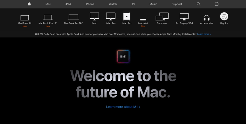
1. Apple
UX design element of focus: Navigation
One of the first things to get right on any website is navigation, which helps users find their way around a site. If users can’t figure out how to get from one page to another, or they can’t find what they’re looking for, they won’t stick around.
Apple provides particularly effective navigation on its website.
![]()
In addition to the standard navigation bar at the top of the page, visiting the “Mac” section of the site provides you with a lineup of all Apple’s Mac products — denoted by names and simple icons — to help you find what you’re looking for quickly and easily.
You can follow Apple’s lead by keeping your site clearly organized and making it as easy as possible for users to find their way to product and service pages. The easier it is for them to find things, the more conversions you’ll generate.
2. Queens University
UX design element of focus: Visual appeal
Visual appeal is essential for any website. Even if all the technical elements work flawlessly, it won’t matter if your site doesn’t look good — users won’t have much desire to keep looking at it.
Many elements can factor into visual design, including:
For a stellar example of effective visual web design in action, look at Queens University of Charlotte.
![]()
On their website, they create an attractive visual design in several ways. Their color scheme across the site is consistent with their school colors, they practice good alignment, and they break up text with headings and images to prevent it from becoming too cluttered.
Take inspiration from Queens by making your website design consistent with your brand. Use colors and font choices to evoke the unique look you want to convey. Try to align your elements neatly as well so everything looks smooth.
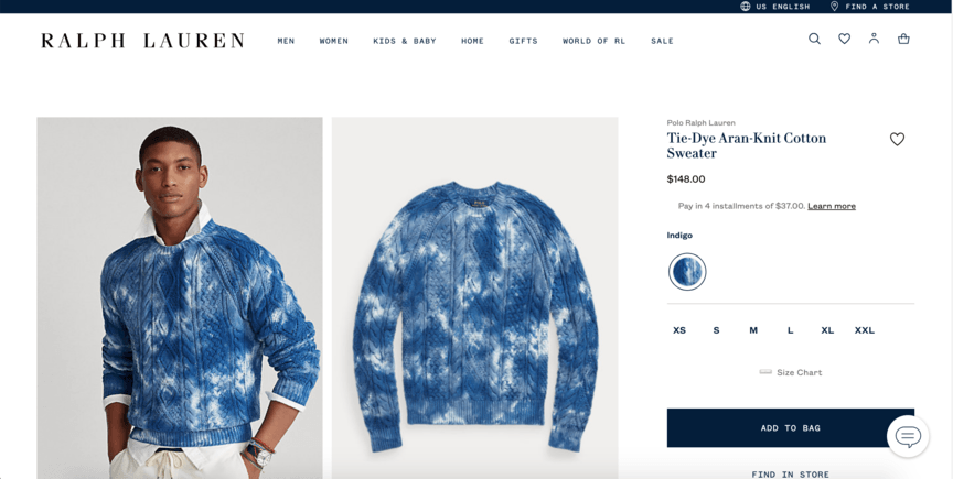
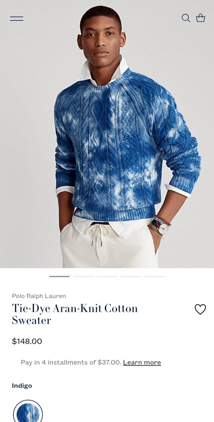
3. Ralph Lauren
UX design element of focus: Responsive design
If you think your website only needs to be optimized for computer screens and not for phones, think again — over 50% of all Internet traffic comes from mobile devices. Furthermore, Google ranks sites based on their mobile format, so a non-mobile-friendly site won’t rank.
The best way to make your site mobile-friendly is to practice responsive design, where the layout of your site changes to best fit the screen of the device users use. Ralph Lauren’s website provides a great example of mobile-friendly design.
![]()
![]()
When you view their product pages on a computer, the product images appear on the left, and information like name and price is to the right.
But on a phone screen, the page layout shifts to accommodate the vertical structure — the images are on top and the information beneath them.
You can replicate Ralph Lauren’s success here by building responsive design into your site from the very start, so it accommodates users on all devices.
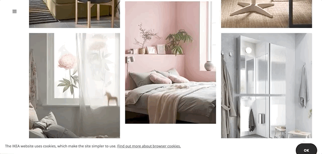
4. Ikea — interactive elements
UX design element of focus: Interactive elements
The best UX designs don’t just meet the minimum requirements for a good website — they go above and beyond with their design. One way to do this is to incorporate interactive elements on your website, where the site responds directly to user behavior on a page.
Ikea is one of the best examples of UX design in this regard.
![]()
On their homepage, they show images that feature their products. When you move your mouse over the images, you can highlight specific products located in them, along with their prices. It’s a feature that’s both useful and creative.
Try following Ikea’s lead by including some interactive elements for users to engage with. You can use something simple like Ikea did, or you can aim bigger with something like an interactive pricing chart that changes in response to the information users plug in.
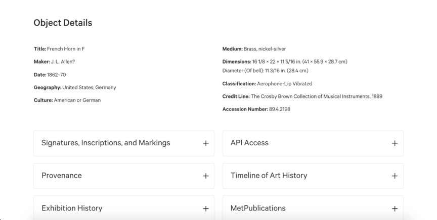
5. The Met
UX design element of focus: Copywriting
Not every user comes to your website to buy something right away. Many people may find themselves on your site because they’re looking for information. By including relevant and useful information on your site, you can encourage those visits and make users happy.
The New York Metropolitan Museum of Art offers one of the best UX designs when it comes to simple but effective copywriting.
![]()
On the Met’s website, you can find pages detailing all the items displayed in the museum, with photos at the top and other information beneath them. The information includes everything from time period to exhibition history and appears in drop-down boxes to prevent clutter.
People may start out visiting the site to learn about a particular piece, at which point the content will pique their interest, and they’ll decide to visit the Met in person.
You can mimic this effect by writing blog posts and service pages that inform users about topics in your industry, both directly and indirectly related to what you sell. Interested parties will come to learn about the subject, and may end up buying from you later.
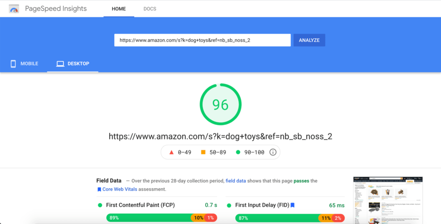
6. Amazon
UX design element of focus: Page speed
Did you know that 83% of users expect the websites they visit to load in three seconds or less? If your site doesn’t load within that amount of time, you’ll end up with most of your users hitting the “back” button.
Amazon is one company that doesn’t need to worry about this issue. When people search Amazon’s website for products, they tend to get results quickly.
![]()
A great tool for seeing a website’s page load speed is Google’s PageSpeed Insights. When we use it to measure Amazon’s page speeds, it gives it a 96 — an incredibly positive score.
You can aim for the same smoothness as Amazon by optimizing your own page speeds. Here are a few ways you can achieve faster page speeds:
With a fast-loading website, you’ll retain far more users!
Let WebFX help you bolster your UX website design
Want to attract more users to your site with stunning UX website design? WebFX can help! With over 20 years of experience, we know web design inside and out, and we have a history of driving results for our clients.
With our web design services, you’ll receive help optimizing your website for each of the features highlighted in the above UX design examples and more. You’ll also receive a dedicated account representative to keep you informed of everything we do for you.
To get started with us, just call us at 888-601-5359 or contact us online today!
The post 6 Amazing UX Design Examples from Across the Internet appeared first on WebFX Blog.
Package:
Summary:
Register new WordPress post types and taxonomies
Groups:
Author:
Description:
This package can register new WordPress post types and taxonomies...
Read more at https://www.phpclasses.org/package/12025-PHP-Register-new-WordPress-post-types-and-taxonomies.html

We live in an era where web designers have become ultra-specialized. Many tend to have a narrow focus regarding the tools they use and types of projects they accept.
It didn’t used to be this way. Back in the late 1990s and early 2000s, the industry was a bit scattered. I certainly fit that mold. I tried a little bit of everything: building with static HTML, flat-file systems and a few assorted content management systems (CMS).
Eventually, I happily settled into a comfort zone with WordPress. In fact, things have gone well enough to where I generally don’t like to venture outside of this self-imposed bubble. Why? For me, that familiarity means I can work more efficiently. Plus, there really aren’t any limits as to what I can build with my favorite CMS.
That’s not to say that I don’t break free on occasion. For example, I might use HTML for a single-page or quickie project that doesn’t require much functionality. There have also been times when agency clients have asked me to work with a proprietary CMS: Miva (for eCommerce) and Wild Apricot (for membership sites) are two examples.
And, despite my own reservations, I believe branching out a little has been a positive experience. The following are a few reasons why I think learning multiple CMS can be a good thing for every web designer.
The Web Designer Toolbox
Unlimited Downloads: 1,000,000+ Web Templates, Themes, Plugins, Design Assets, and much more!
Compare and Contrast Methods for Building a Website
Probably the most obvious benefit to working with more than one CMS is observing their differences. That holds true for both open-source and proprietary systems. And the methods used to build a website can vary quite a bit.
Some systems, particularly proprietary apps like Squarespace or Wix, will be a more front-end focused experience. You pick a theme, then start adding content and bits of desired functionality. There may be some opportunities to dig into back-end development, but that’s not the primary aim of the system.
An open-source CMS, such as WordPress or Drupal, is going to provide a lot more options. You can go the readymade theme route, or opt for something completely custom. There’s less hand-holding, which can mean a more holistic approach is in order.
How is this beneficial? Well, working with the same system over and over can lead to a more rigid way of thinking. Utilizing different systems teaches us that there is more than one way to accomplish a particular task. That in itself encourages us to think about building sites in a more flexible manner.
Lessons in User Experience
Experimenting with multiple CMS is also a great way to learn about user experience. Whether it’s a drag-and-drop page builder or a dashboard interface, you’ll quickly gain an understanding of what does (and doesn’t) work.
For example, an unintuitive dashboard can make it difficult to create content or tweak settings. You may find that it takes more effort to train clients. And in some systems, important items could be buried and require several clicks to get where you want to go.
These kinds of experiences have the potential to positively influence your own design work. Knowing the difference between good and bad UX is invaluable when working with clients. It enables you to better guide them during the design process.
It also results in a bit of self-reflection. You may discover that you’re utilizing some of the very same techniques that drove you up a wall when navigating a particular CMS. Seeing this can help you realize what’s missing and provide you a path for fixing any shortcomings.
Sometimes, nothing sparks a change in your own work like seeing living examples of the good, bad and ugly of UX.

Develop a Better Understanding of Your Niche
Being stuck in a single-CMS bubble can mean losing perspective of where you are in your career. It’s harder to perform a self-evaluation when there’s not a lot of variety in what you do. Quite often, it’s easier to just keep forging ahead on the same path.
Unfortunately, that can lead to stagnation. That’s why it’s important to keep on challenging yourself and your knowledge. Doing so means asking questions, such as:
- Are you serving clients in the best possible way?
- What additional types of functionality would benefit your projects?
- How can you learn and grow?
Going on an adventure or two with different systems can be a big help in answering these questions. They run the gamut in terms of what they’re capable of. Each has their own distinct strengths and weaknesses as well.
Add it up and you may find some areas where you can expand and improve. That could mean moving more projects to a different CMS. Or it might be a matter of taking what you’ve learned elsewhere and applying it to your preferred system.
Regardless, it’s an effective way to see where you stand and look ahead to the future.

Stepping Into the Unknown
The longer you’re a part of the web design industry, the more likely it is that you’ll develop a list of favorite tools. A CMS is often part of that collection.
Of course, there’s nothing wrong with preferring a particular CMS and specializing in it. Having intricate knowledge of a system means you’ll likely accomplish more with less effort. That keeps costs down and enables you to take on more projects.
But there is also something to be said for gaining experience elsewhere. Leaving your comfort zone is an opportunity to expand your horizons. You’ll see how other systems work and gain some perspective when it comes your own methods for doing things.
The best part is that you don’t need to make a large commitment. It could be as simple as installing another CMS in a local environment and poking around. That alone will give you a taste of what else is out there.
So, no, you don’t have to replace your favorite CMS. But there are some real benefits to busting out of that bubble.
The post Why Web Designers Should Learn Multiple Content Management Systems appeared first on Speckyboy Design Magazine.
Package:
Summary:
Manage table data records stored in JSON files
Groups:
Author:
Description:
This package can manage table data records stored in JSON files...
Read more at https://www.phpclasses.org/package/12051-PHP-Manage-table-data-records-stored-in-JSON-files.html

Package:
Summary:
Execute shell commands and return the results
Groups:
Author:
Description:
This package can execute shell commands and return the results...
Read more at https://www.phpclasses.org/package/12040-PHP-Execute-shell-commands-and-return-the-results.html#2021-04-17-05:52:34

Package:
Summary:
Benchmark sorting arrays with different algorithms
Groups:
Author:
Description:
This package can benchmark sorting arrays with different algorithms...
Read more at https://www.phpclasses.org/package/12046-PHP-Benchmark-sorting-arrays-with-different-algorithms.html#2021-04-17-02:49:55

We travel to feel alive. But as soon as we come back home, we want to share our experiences with the people we care about. Unfortunately, not even our cameras can really capture the atmosphere of a special moment; the vibrant sights, colors, smells, and the wind blowing in from the east that makes us feel like this is it – this is the moment we have been waiting for.
For that, we need post-processing and editing. In order for our photos to really get the atmosphere we’ve experienced (and that our followers, clients, and friends can see), we need Lightroom. Now, editing normally takes hours. From making sure we don’t muck up our standard settings, to squinting and wondering if the result looks good. Then multiply it by as many photos as you want to edit. It’s a whole lotta work!
Fortunately, we’ve found the best Lightroom presets for landscapes and travel. So if you’re dying to share your last trip with the world, make sure you scroll down and check out our list. From presets that emphasize warm tones, to presets that bring out the full beauty of the wilderness, there’s something for everyone. These presets are incredibly easy to use. You just have to download them and apply them to your photos – no matter how many there are. Your photos will look consistent and beautiful. Let’s get to editing!
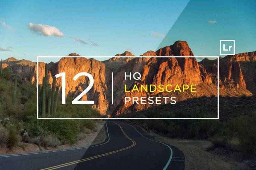
Highlight every part of the beautiful landscape you’ve captured with these high-quality landscape Lightroom presets. You’ll get 12 professional presets that guarantee stunning and clean results. Instead of completely transforming your photos, they’ll enhance the best parts of them, and make your shots irresistible.
If you often take and edit landscape photos, you’ll love this landscape Lightroom presets collection. It offers 100 presets to help enhance your photos’ beauty. You can easily edit the effects, as the presets have been made with the most important aspects of travel photography in mind.

Atmospheric and moody, Arcadia landscape presets for Lightroom are the perfect choice for editing photos of nature and rural landscapes, as well as general travel and scenic photography. The presets are 100% adjustable, so you can count on receiving beautiful and authentic results for your portfolio or social media feed.

If you want to bring out the best features of your photos, you need these 12 travel and landscape Lightroom presets. They guarantee clean and beautiful results, making them perfect for a variety of travel and landscape shots. You can use them on social media, magazines, or for your portfolio!

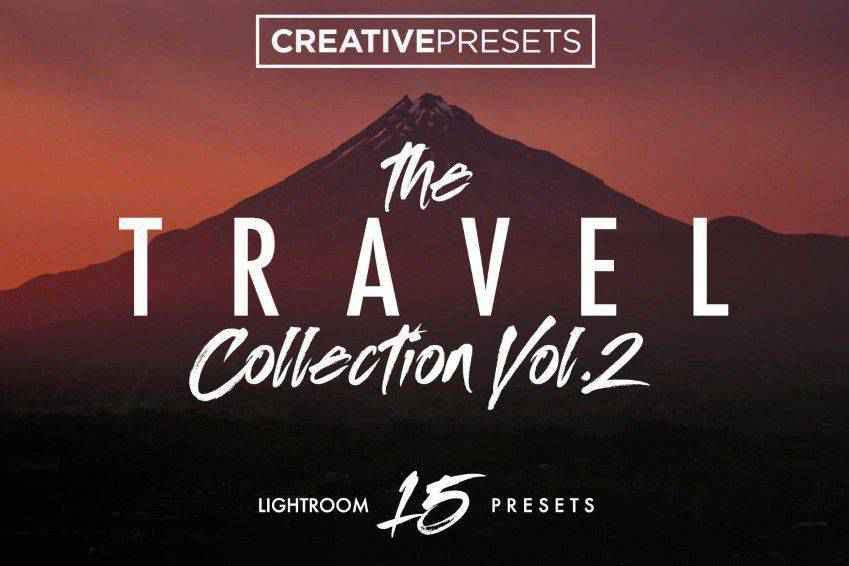
Perfect for adventurers! This travel Lightroom presets collection offers 15 premium filters that give your photos incredible light and tones. You can easily work with contrasts, enhance brightness, adjust colors, and use other editing aspects to create stunning photos. You can easily mix & match different presents for phenomenal results.

Inspired by the creators’ recent trip to Morocco, these Lightroom presets offer stunning filters for your warm and atmospheric photography. You’ll get 15 Lightroom presets that work perfectly with vibrant tones, and help you emphasize the atmosphere you’ve experienced for your followers, clients, and friends.

Create a beautiful and consistent travel photography style with these 15 Lightroom presets for travel and landscape photography. They make editing seamless, and bring out the best aspects of your photos. You can easily customize various effects to suit your style, and share the magic with viewers, followers, and clients!
Make your audience feel as though they’re experiencing your photo firsthand with these Adobe Lightroom presets! They’re perfect for nature and landscape photography and guarantee a smooth finish. You’ll get authentic shots because the presents were made with 3D color grading profiles in mind.

There’s no hour like the golden hour! These stunning Lightroom presets for landscape (as well as portrait) travel photography know it, and help you show it through quick and seamless editing. You’ll get 11 presets that simulate the golden hour lighting, perfect for magazines and portfolios!

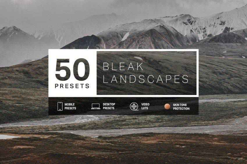
Create authentic and moody atmospheres with these travel and landscape Lightroom presets. Featuring 50 presets perfect for atmospheric and unique photography of destinations such as Iceland and Alaska, this collection works for mobile and desktop editing, and you’ll also get 3D-sensitive LUTs for videos and other editing software.
Emphasize vivid colors in your travel and landscape photography with these Lightroom presets. You’ll get 30 Lightroom presets that emphasize saturation and contrasts, creating a warm atmosphere for your photos. You can easily customize the effects to suit your style, and take your audience’s breath away.

Answer the call of the wild with these stunning and adventurous Lightroom presets. Perfect for landscape and travel photography, these presets offer various styles and filters, allowing you to create the perfect atmosphere. You’ll get 11 Lightroom presets for stunning social media, blog, portfolio, and magazine photography presentations!

Express your art by editing your photos with these professional landscape and travel Lightroom presets. This beautiful collection offers 15 atmospheric Lightroom presets that can help you convey the right atmosphere, and help your clients and friends immerse themselves in the experience. You can customize them to fit your style.

Diverse and striking, this Lightroom preset collection is perfect for nature and landscape photography. You’ll get 50 beautiful presets; from forest colors inspired by Japanese anime, to filmic tones and green and teal palettes. There’s plenty to pick from so add this collection to your kit!

If you often take shots with your drones, you’ll love this Lightroom preset collection! Give your aerial photos a special atmosphere with these 30 premium presets, made with drone footage in mind. There’s a variety of filters that suit different lighting conditions and guarantee stunning results.

Are you ready for wanderlust? With these 15 Adobe Lightroom presets for landscapes and travel, you’ll be able to convey the exact atmosphere you’ve felt when traveling and shooting. From Morocco to the Scottish Highlands, these presets can bring out every atmosphere! So no matter where in the world your viewers and followers are, they’ll be able to feel a fraction of what you’ve felt, and love you for it.
Not to mention that your photos, once edited, will make even the likes of National Geographic photographers jealous! If you’ve been checking out a specific travel Lightroom preset collection, don’t wait a second longer. Instead, hit that “Download” button, add it to your Lightroom kit, and edit your photos in a matter of minutes. The world needs your perspective. It’s time to share it!
The post The 15 Best Lightroom Presets for Landscapes & Travel in 2021 appeared first on Speckyboy Design Magazine.