Stisla – A beautiful, free Bootstrap admin template.
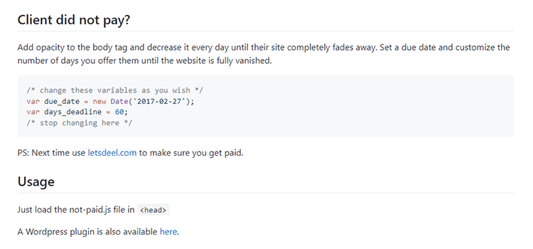
Not Paid – Have a client who hasn’t paid? Send a message with this JavaScript that decreases the opacity of their website each day until it fades completely.
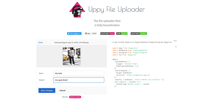
Uppy – A sleek, modular file uploader that integrates with any website or app.
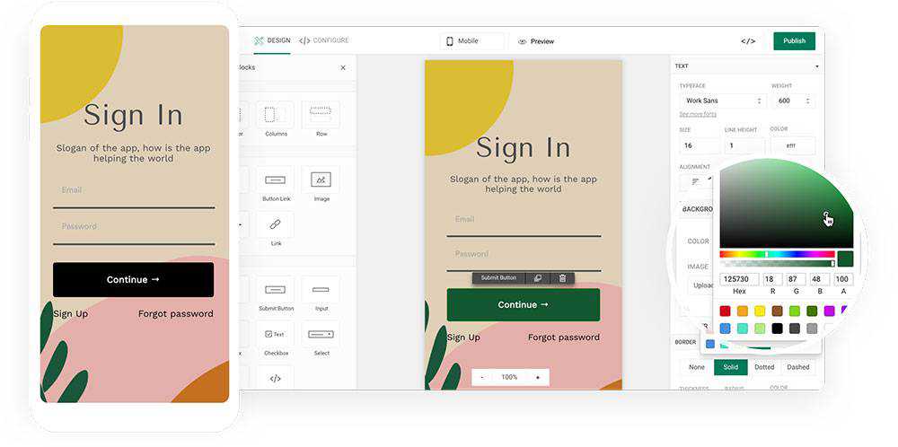
If you can create a user login form for your product or app in minutes – and without coding – you must be doing something illegal or magical. Or, you could be using Mason, a feature-building platform designed for teams to work together to design, build, and deploy front-end features.
Let us first explain what Mason is. Then, we’ll show you how easy it is to build, design, and deploy a login form in mere minutes.
Mason is a front-end-as-a-service platform on which you can design, build, and deploy fully-functional features for software applications. You’re given total control in managing your front-end experiences in your codebase, making it possible to create a live feature in minutes.
Mason effectively eliminates the need to provide documentation for development and having to wait for the next deployment cycle; thereby eliminating weeks if not months from your work schedule. You’ll consolidate prototyping, QA, and engineering down to move at lightning speed.
Here’s how you use Mason:
Pick a component or components from the platform that you will use to design the feature you wish to create; in this case either a single user login or a login flow with its various commands and options.
Pick a template to work from or build your own. Either way, you can customize it down to the final pixel.
Snag a developer for a few minutes, have them help you connect your API endpoints, hit “Publish” and your newly created feature is live in seconds. Now, you can export your feature and with a single line of code, drop it into your codebase.
How to Create a Login Form Without Writing Code
As you’ll see from the video tutorial, it’s not at all difficult. All you have to do is hit Play, sit back, and prepare to be impressed with how easy it can be.
If you’d like to go through the instructions one more time to make sure you have them right, we’ll repeat them for your benefit.
You’ll be using Mason Canvas and Mason Builder to create the user login form.
Mason Canvas is a virtual whiteboard on which you visually create your front-end design. No coding is involved, and you won’t have to hand your design over to a development team.
Mason Builder enables you to create and customize features for a website or app and connect them to the already existing backend.
It’s important to note that whenever you make a change to a feature, it automatically translates into valid HTML/CSS; code that doesn’t require debugging that could slow the deployment cycle.
With these tools in hand, you’re ready to proceed by following these step-by-step instructions:
Step 1. Shape Your Login Form
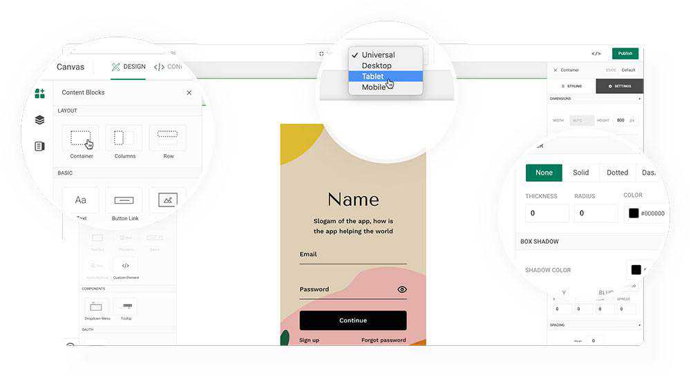
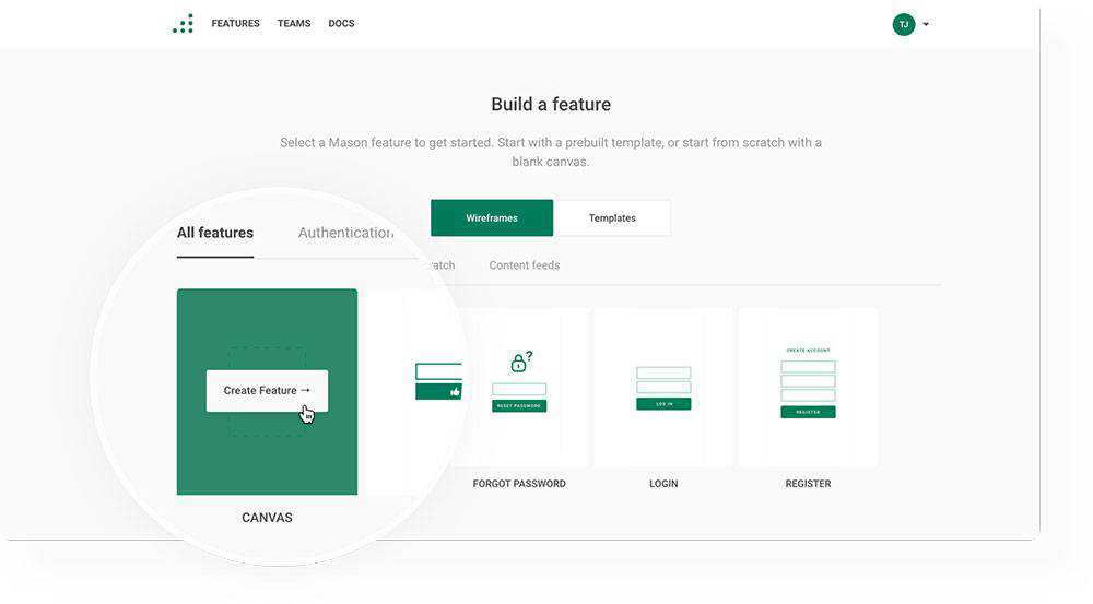
When you log in to your Mason account you’ll see a “+New Feature” button. Clicking on it will present a variety of options. Click on the “Canvas” option.
+New Feature → Canvas
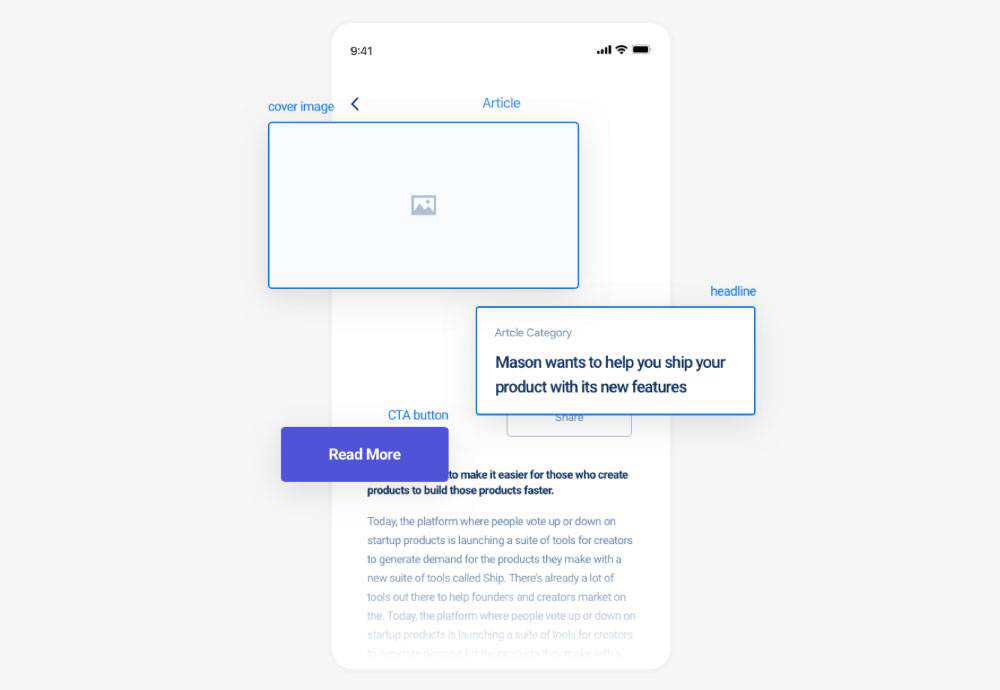
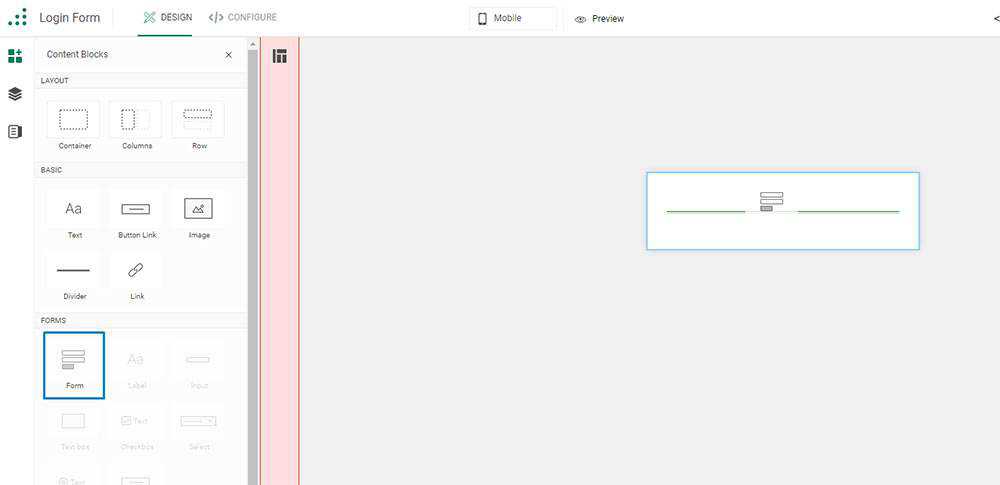
Next, click on the “Elements” tab (on your left), and go to the “Forms” section. Select a form and drag and drop it into the Container which already resides on the Canvas.
Elements → Forms → drag-and-drop form from Canvas
Click on the white space around the form to select the Container. Upon doing so, you’ll see a bar to your right. Important: Check the bar to ensure the height is set at 100% before proceeding.
You now have only 3 clicks to go to shape your login form! Well done!
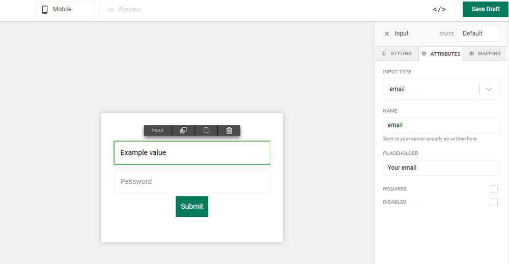
Select the “Data” input form inside your form and click on the “Clone” tab at the top in order to add as many input fields as you’ll need. You’ll then want to toggle to the “Attributes” tab on the bar on your right to select the type of input you need for each field – text, number, URL, etc.
Data → Clone → add input fields
Data → Attributes → select type of input for each input field
Step 2: Customizing Your Form
Customizing a form using Mason is essentially a no-brainer. Select your form one more time and look for the “Styling” sidebar. “Styling” lets you style your form any way you want including changing colored editing borders, changing size or background, and more.
Once achieving the style you want, move to the “Submit” button, which by the way, you can also customize.
All that’s left is to hit “Publish”.
Don’t forget to hit “Save” periodically as well to save your work!
Step 3: It’s Time to Make Your Form Fully Functional
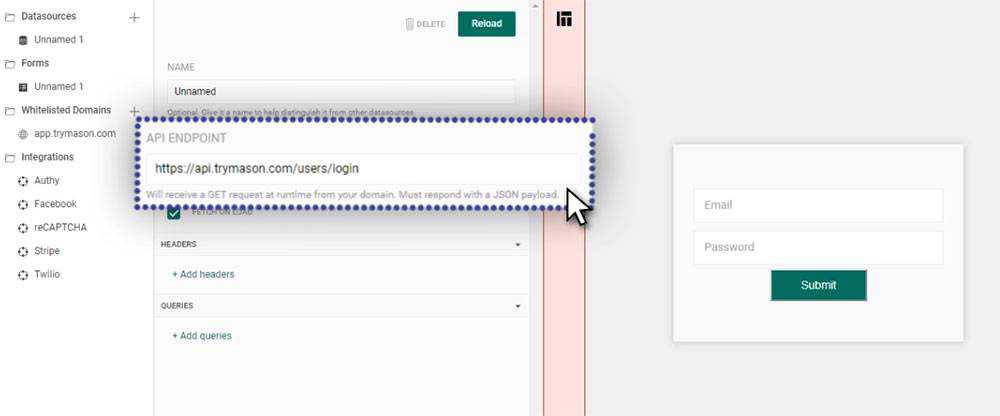
To make your form fully functional you need to go to Configure and select “Datasources”. This is where you fill in your API Endpoint. A developer on your team can help you with this in just a couple minutes if you’re not a technical product user.
In the event you’re not sure what an API Endpoint is, its an address (URL) that enables users to access your application (in this case, log in).
Datasources → fill in API Endpoint
Next Step: Go back to the “Forms” section and select “Post” as your submission method. All that’s left is to hit “Publish” and click on the “Preview” button to verify that everything is in order.
Forms section → Post → Publish → Preview
Step 4: Testing the Login Form
Since you followed these instructions, you can be confident that everything works, but it never hurts to check. You can do so by checking the network request with a Chrome’s developer tool.
Simply go to “Inspect – Network” where you can see requests the browser is making. By filling in a few test credentials you can verify that your form is working as planned.
Other Cool Things Mason can Do and Why You Should Try It
Where designing and building functional pieces for a UI can easily take weeks or even months, you can achieve the same result in minutes with Mason and test your creations in seconds – saving time, money, and resources in the process.
And, you receive these extra benefits as well:
Lightning-fast turnarounds in delivering functional solutions will amaze your clients by far exceeding their expectations.
You won’t be stuck on a single project for weeks. Instead, you can take on extra work and make room for new clients.
The features you create will be consistent with brand style guides. If something changes, like a color or font, just change it inside Mason, hit Publish, and your changes will be pushed live to your already-functional front end feature.
Mason is team-oriented. By doing all the work on the front-end, your team members feel empowered, and collaboration between team members, clients, and other project stakeholders becomes second nature.
Best of all, downtime and deployment cycles you once had to endure can become history since any authorized individual can log in, make a change, and make the updated feature live.
Increase your team’s productivity by at least a factor of 10-Mason is open and ready for you, and it’s free to start, so click here to give it a go!
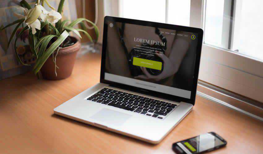
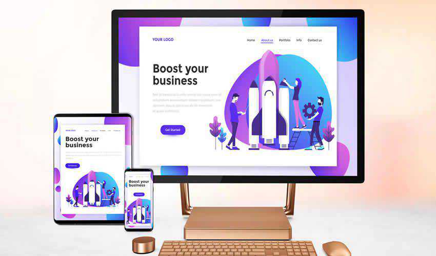
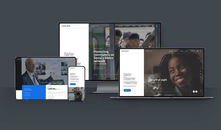
If you’re a designer, you probably know that showing your clients that their website will be responsive can be tricky without doing the actual coding. Designing different device mockups and resizing your design each and every time takes time but with a little help, you can easily show how a website will look on different devices.
All you have to do is download one of these free responsive website mockups and drop in your finished design.
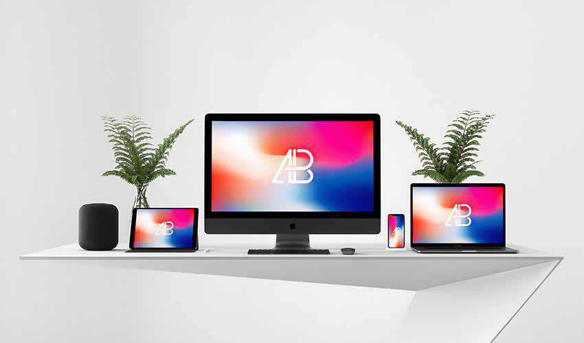
The first responsive mockup on the list is a great choice as it features a minimal design. This means the background of the mockup will not distract from the website design. The mockup includes a variety of Apple devices. You can use it in personal and commercial projects and attribution is required.
This web mockup is sure to make your project stand out and capture clients’ attention. It features a perspective view of the website in mobile screen sizes. Thanks to smart objects, all you have to do is drag and drop your design into the PSD file and export it.
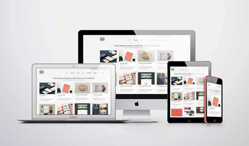
This mockup pack makes it very easy to focus on your finished website design. The pack includes different Apple screen sizes and can be used in both personal and commercial projects.
If you’re looking for a mockup that’s easy to edit, look no further than this screen mockup pack. You’ll get a total of 10 unique mockups all of which use smart objects for easy editing.
This pack contains 7 free smartphone and Macbook Pro mockups. All of the mockups make use of smart objects so adding your finished design is easy and quick.
If you prefer working in Adobe XD, then this responsive kit is the perfect choice. The kit contains different mockups for desktop, tablet, and smartphone devices. You’ll find 3 large desktop screens, 3 desktop screens, 1 desktop overlay, 3 tablet screens, 3 mobile screens and 1 mobile overlay screen template.
This mockup pack features a clean design style and includes 6 different mockups in high resolution. You’ll find different device sizes and the mockup contains smart objects for easy editing.
This free mockup template contains 4 different device sizes which include a desktop, a smartphone, a tablet, and a laptop. The template can be used for both personal and commercial projects and includes a high resolution file with smart object.
If you’re looking for a simple way to present your responsive website design, then this template is a perfect choice. This template includes a high resolution, layered PSD file with smart objects. Perfect for business website or app mockups.
Try this template if you’re designing website in Sketch. This mockup features a dark style which is perfect for making your website design mockup stand out more. The template includes a desktop and a smartphone mockup.
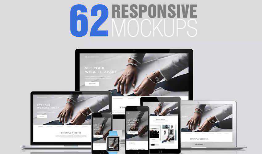
Never run out of different ways to present your responsive website design again. This huge template pack contains a grand total of 62 mockups in high resolution. The pack includes fully layered PSD files and smart objects for easy editing.
Free Responsive Browser UX Mockup Kit for Photoshop (Free)
For a slightly different approach, consider using this free Responsive Browser UX Mockup kit. The kit includes a mockup of the Chrome browser in varying sizes. Simply drop your design into the smart object and watch the magic happen.
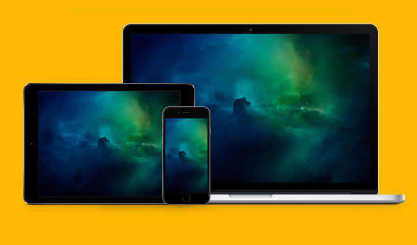
A great way to showcase your responsive web designs is with this mockup featuring a MacBook, iPad and iPhone. The template includes a completely layered PSD file in high resolution with three smart objects.
This set of templates includes 10 unique designs with smart objects which makes editing them a breeze. You can also easily adjust the blur. The template is free to download and use in any type of project.
This pack is perfect for adding a touch of class to your project presentation. The set features a variety of Apple devices and you can easily add your design by editing the smart objects.
This free mockup is a great way to present your website design when you need to create it quickly. The mockup contains a single, layered PSD file with three different screen sizes.
Make sure your clients know how their website will look when viewed on different devices with one of these responsive mockups. The best part about them is that you only have to download them once and you can reuse them in any future design projects as well so be sure to check them out.
We seem to be surrounded by those who are obsessed with productivity. We want to or are pressured to do better and do more in less time.
We’re told that efficient work habits can eventually spill over into our daily living. This can allow us to harmoniously blend together work, fun, and family. There’s an element of truth to that.
Our message focuses more on ways you can be more efficient, and more effective in your daily work.
Tech advances can be both a blessing and a curse. While technology can help us do tasks better and more quickly it can also give us more tasks to do. Smartphone productivity apps can, for example, be used to manage our scheduling. You can organize our tasks, and access information on the spot.
Invest in a few of the tools we’ve selected here and follow our productivity tips. You’ll discover improving your productivity can become habit forming.
Mason isn’t your typical web design tool in that it allows you to consolidate steps in the design/build/deploy process that you probably thought could never be skipped.
Mason is a front-end feature building platform for product teams, where you can create, design and build functional digital and software features for websites, apps, and nearly any other digital product. Your final design, which you can view in the builder, is inserted into your product with a *single line of code*– skipping a need for prototyping, documentation, and QA inspection, and minimizing any need for expensive developer resources.
Mason also helps you save post-deployment time and money. It’s not only developers that can quickly make changes to their front-end experiences. Any authorized person, including website and business owners, designers, copywriters,a nd more can make changes to an active software application if they have a Mason account; shortening the deployment cycle, and reducing downtime to minutes.
If you’ve been looking for a UI/UX tool that’s fast, reliable, gives you precise results and is a time and money saver give Mason a look. You can start free today.
Proto.io is designed to satisfy all your prototyping needs along both the early and later stages of the design process. During the early stages you can use this intuitive tool for wireframing and for building low-fidelity prototypes to test your concepts and receive feedback.
Proto.io will also serve you well later in the design process with its ability to produce high-fidelity prototypes for user testing and design approval and signoff.
The Proto.io Editor does all the heavy lifting when you’re building a prototype, and the Player feature lets you view the results on your browser, share design information with others, and conduct user testing. Lastly, its Dashboard feature helps you manage your users and projects.
With this prototyping tool in hand you can build high-fidelity prototypes that give you the exact experience, look and feel you expect the final product to exhibit on a desktop or mobile device.
The monday.com team management tool provides a centralized platform on which project leaders and teams can manage every aspect and detail of their work, from high-level planning to details of day-to-day tasks.
To effectively help teams make changes to increase productivity, the team members have to love the tools they’re expected to use, and more than 50,000 teams around the globe love what monday.com does for them.
monday.com shows who’s in charge of what, tracks time, promotes transparency, improves communication and collaboration, and since it can be seamlessly used on your computer or your phone, location is never a problem.
monday.com’s operation is simple but not simplistic and it is so easy to work with it’s become extremely popular with non-tech teams looking for a substitute to replace whiteboard presentations and excessively lengthy meetings.
In short, this project management tool offers an easy way to centralize and streamline your workplace flows and processes.
ActiveCollab is project management software designed for creative professionals and it lets you organize your entire work and deliver exceptional service to all your clients.
The new ActiveCollab features a completely redesigned interface, and a slew of visual and technical improvements, including a task rescheduling system that automatically manages task dependencies (e.g., parent and child tasks). There are also multiple task views that enable you to see project status at a glance.
Nutcache offers an excellent solution for team collaboration issues. Enhanced collaboration generally leads to improvements in overall project performance. This productivity tool will also help project leaders streamline workflows in ways that ensure tasks are completed on time and within budget.
This all-in-one project management software tool is ideal for design teams and project managers that subscribe to Agile principles and practices.
Lucidchart’s use of visualization techniques helps its user do a better job of communicating, especially with complex ideas or subjects. An example would be explaining technical flows and processes to non-tech speaking clients.
Visualizing workflows and processes also helps you better organize ideas and goals; more effectively than lengthy textual material can ever do. Lucidchart is easy to use and features a custom shape library to help create outlines and diagrams.
5 Productivity Tips to Achieve More & Create Peace of Mind
Write it down If it’s important, write it down. If you’re not sure of its importance, write it down. This applies to every commitment and every task you make. Doing so will free your mind from uncertainties associated with trying to remember.
Do the Dreaded Stuff First Almost everyone has a tendency to put off a dreaded task as long as possible. This can come back to bite you when it’s a high-priority task. The good news is that when you tackle a task you dread or fear head-on, you’ll usually feel pretty good.
Take Breaks According to the experts, taking a break about every 45 minutes is about optimum. That’s about the time you start to lose focus, and the law of diminishing returns begins to set it. Find an interval you’re comfortable with and try to make a habit of following it.
Get Some Exercise Think “sound mind, sound body”. The two tend to go together. Exercise makes you healthier and keeps you that way.
Learn to Say No Trying to please everyone or feeling a need to take on every assignment can lead to work overload. This is equal to the loss of control and productivity.
Conclusion
There’s a host of different things you can try to boost your productivity. But if you’re trying too many, you’ll reach the point of diminishing returns. You could actually find yourself or your team is becoming less productive.
Keep things simple with one or more of these top productivity tools. Make the productivity tips we’ve shared with you a habit. You’ll be amazed at how much more you can actually accomplish in a given amount of time.